In 2015 I was asked by Bariquins to produce a logo for their product, a bariatric training mannequin. The mannequin weighs 25 stone and has 15 parts. It was designed to assist the manual handling training of healthcare workers, emergency personnel and others, enabling them to safely manoeuver and rescue plus-size people.
The typeface used is Sabon. The idea behind the icon is a side view of a body which has different sections - referencing the 15 different parts of the mannequin. Red and black are the corporate colours. The bottom line of text is in both colours to make the words stand out.
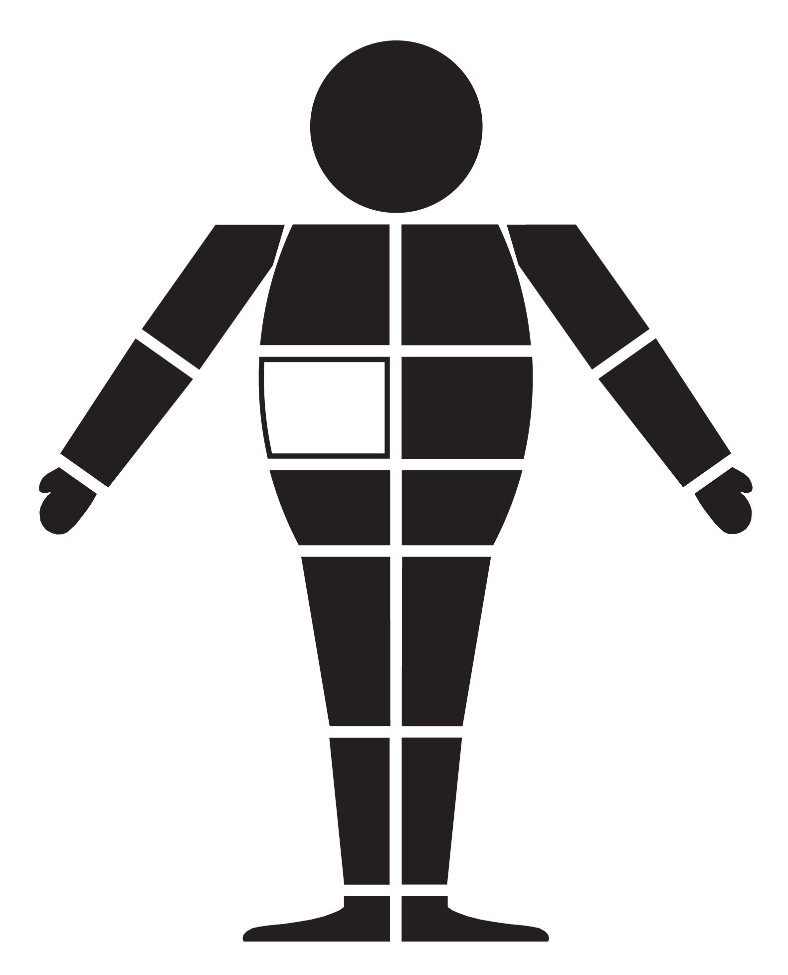
I also produced a mannequin image. The image is on each section of the mannequin, and the outlined section shows which part of the mannequin it refers to [in this case the middle section of the torso].